Sunday, April 14, 2013

Principles of Design - Proportion

Principle of Design - Proportion
 The next principle of design to write about is proportion.  This principle is closely associated with scale because they both express concepts of relative size and magnitude.

Proportion is defined as the relationship of the parts to one another or to the whole.  Scale refers to the size of a item in relation or comparison to another item.  Proportion is thought of as the relationship of parts contained  within an object.

Proportion can be expressed as matters of width in relation to length with which designers seek to balance the parts to one another to create an aesthetic composition.

The Greeks create the basic principle of proportion when they developed the ""golden rectangle" which is a ration of two parts to three.  The golden rectangle represents the division of a form or line in which the side of the smaller portion in relation to the larger is identical, as the side of the larger part is to the whole object.  This idea is that the division of a line between one third and one half of its length which produces a pleasing proportion to the eye.

The photo above of Frank Gehry's AGO shows the curved wood divided in 3 thirds to create a very proportionate design as the wood bends up the side of the building.


The image to the right shows how the stairs have a yellow paint line on the top third of the step.  It creates a pleasing proposition of the steps and a beautiful pattern as you look up the stairs.


References:

  1. Kilmer, Rosemary & Kilmer W. Otie (1992). Designing Interiors. Orlando, FL.  Harcourt Brace Jovanovich College Publishers. pp 119-120


Sunday, March 24, 2013

2013 Spring color trends

2013 Spring color trends:
Spring is in the air and time to talk about the Pantone spring color trends for 2013.
This spring the color trends are all about balancing the brights and pastel soft colors of spring.

This spring using 3 shades of green to really bring life into the season.  Green is a great color and I love the 3 different shades of green in the color trends since this is a green for everyone.

Below is a link to the entire Pantone 2013 color trend report.

Pantone 2013 fashion color report spring 2013 link


Thought on the color trends for spring:

 I love the use of soft pastel colors this spring mixed with the bright colors.  My favorite color in the spring color trends is Linen.  I it s lovely simple neutral that works with any other color to soften up your spring look.  It is a fresh new color for spring and I just love it!

Inspiration:
This spring I am building a home I designed and most of the colors I am using in my house are in the Spring 2013 color trends.  Most of the house is a warm grey with white and espresso brown wood.   The accent colors in the house are Poppy Red, Vibrant Orange, Emerald and Tender shoots.

Prominent Colors:
This spring in my fashion I have been really drawn to Emerald.  I love green and it balances my red hair, pale skin and green eyes.  It is a fun fresh color that can put anyone in a good mode.  We have had a long winter so I think that is also why I have been drawn toward green.   


Signature color:
My signature color is orange!  This spring I am love mixing Nectarine with Linen. They complement each other nicely.  I love a pop of orange and I love the men's color vibrant orange this spring as well.

Must have item:
My spring must have is a fun floral skirt and peplum top.  I love the way a peplum top creates amazing curves on every body type.  It is a must have this spring.

Below are the Spring 2013 color trends for men. They changed the orange to be a little brighter which I really like, changed the yellow to a more gold shade and added 2 grey naturals into the pallet.  It is a very fresh and strong look for spring.  


I really am enjoying the current fashion trends this spring.  There is something for everyone.
Spring fashion trends are:

  • Floral prints
  • Black & white geometric prints
  • Cut outs
  • Bright colors color blocked with the lighter pastel shade
  • Bond stripes
  • Leather
  • Embellishments with beads
  • Sporty
  • Flat or low heels


Let me know what your favorite color and fashion trend is for Spring 2013.

Most importantly is to have fun with fashion and try something new this spring!

Saturday, March 2, 2013

Neutral know how - Buff


Neutral Know How - Buff

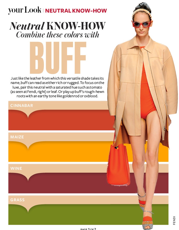
This spring in InStyle magazine they have had a section called neutral know how which gives you great tips on what colors goes with what neutral.

I really was inspired by this so I wanted to share with you the tips and ideas on a few outfits using the color pallets they are recommending.

Buff is a great simple color that everyone has in their closet.  It is a versatile shade that can be rugged or sophisticated.  If you want to look more luxe pair buff with a strong saturated hue like tomato red or leafy green.  If you want a more rugged look, pair it with earthy tones like gold or oxblood.  Below are 4 work outfit ideas using the 4 colors InStyle is recommending for spring 2013.


 Cinnabar
Pair a bright cinabar orange/red with buff pants or a skirt.  Add some simple nude shoes and classic pearls and you are set for a work day.


 Maize
Pair a maize sweater with buff pants to create a earthy tone easy work look.  I paired a fun red/orange shoes with it to give a little unexpected pop of color which goes with the outfit and is not matchy matchy.

I tend to through on my classic pearls on any outfit to add a splash of class.  They never go out of style!


Grass
Pair a rich grass green top with buff skirt or pants to give a strong spring look.  Shades of green are huge this year so it is a must color in your closet for 2013.

I paired a simple snake skin neutral shoe with the outfit to add some texture to the look.  I love adding texture into outfits to create interest.


Wine
Pair a wine top with buff pants or skirt to create a strong outfit.

I also paired a yellow shoe with this outfit to create interest and to use two of the colors InStyle is recommending to use with buff.


I hope you play with these colors this spring with you buff neutrals.  There are many more Neutral know how tips so more posts to come on this topic.

Let me know what colors worked with your buff neutral.  Have fun! 

Sunday, February 10, 2013

Principle of Design - Emphasis

Principle of Design - Emphasis
The next principle of design I will write about is emphasis.  Some think of it as the focal point of your design.

Emphasis is created when certain design elements are accented more than others, creating a relationship of dominance.  Emphasis gives character and variety to an interior design.  When a design element is to create emphasis it becomes the focal point of the space and is the center of the interest through dominate and subordinate use of form, colors, textures, and lines.  
The focal point should dominate the design without sacrificing the unity of the whole design.

The picture above uses color and contrast to create the emphasis.  The bold lime green becomes the main emphasis of the space and the use of the white pendant and Tulip table & chairs creates a wonderful contract to make the lime stand out even more.  


The picture to the right also uses color to create emphasis in a more asymmetrical way. The bold teal tile in the shower creates the main focal point and then the hints of teal in the towels used in the bathroom creates a sense of unity.

The dominate form (the teal shower) in this picture has the greatest impact and importance; the subdominate (teal towels) are secondary and  complement the former.  All of the forms are important in creating a balanced design.

I tend to use color as the main emphasis in my designs but in my new house I am building I am using more texture to create the focal point.  I will share more photos when the house is complete.

Don't forget to follow me on twitter where I share tips and other great design and fashion articles I love.

References:

  1. Kilmer, Rosemary & Kilmer W. Otie (1992). Designing Interiors. Orlando, FL. Harcourt Brace Jovanovich College Publishers. pp 118

Sunday, January 20, 2013

Principle of Design - Rhythm


Principle of Design - Rhythm
Rhythm is defined as organized movement, regular patterns or recurrences in design.

There are three primary ways to accomplish rhythm in design; repetition, alternation, progression.  Using these methods of rhythm will impacts a sense of movement in the interior space and guide your eye from one design element to another.


Repetition:
This is the most simplest way to create rhythm in a space.  Elements are repeated in an organized manner in the space.  When used in interior design this repetition can also be utilized to carry the eye throughout the space by repeating simple forms, textures or colors.

The picture above shows this with the use of candles on the table.  The candles lead your eyes deeper into the space, pulling you forward.  This is also show with the art shown on the left hand side of the picture. They are all the same size, color and hung the same height.  It creates a pattern.

Alternation:
Alternation of rhythm can create a little more complex design by alternately changing elements within the design.  The picture above illustrates that with the use of the frames art placement with the doorways.  A rhythm is created with the placement of art, door frame, art, door frame, art.
This brings your eye along the hallway to the main focal point, the red painting.

Progression:
Progression of rhythm suggests movement and leads your eye in a certain direction.
The picture above illustrates that with the large round pendant fixture as the main focus and then the smaller candles lead your eye into the space and then the very small ceiling fixture pull you deep into the space.

Rhythm is a relative easy principle to use in design and is important in main entrances to pull a person's eye in and pull them in and make them want to see more.

I am now on twitter so I hope you follow me for simple design tips, sharing of great articles on fashion & interior design, and color trends.

Also send me a comment on what other blog posts you want more or less of!  I would love to hear from you.

References:

  1. Kilmer, Rosemary & Kilmer W.Otie (1992). Designing Interios. Orlando, FL. Harcourt Brace Jovanovich College Publishers. pp. 117

Friday, December 21, 2012

Principles of Design - Balance

 Principles of Design - Balance
One of my favorite design principles is balance.

Balance in design is best described as a visual balance that relates to the apparent perceived weight of an objects within a space.

There are three basic types of balance  symmetrical, asymmetrical and radial.


Symmetrical Balance:
Symmetrical balance refers to the arrangement of objects within a space that appear to have a a central axis and equal on both sides. 

The picture above shows a very symmetrical interior design.  The glass is mirrored from a central wall with a light fixture as it's focal point and the furniture is mirrored on both sides of the center wall.

Symmetrical design is used in a lot of traditional design.   It feels more formal to the eye.  It creates a sense of belonging for the objects in the room which is calming to some people.  This type of symmetry is reflected in the human body which some think that is the reason people feel comfortable in a balanced space.

I do like symmetrical design.  I like order so I am calm and happy in a very balanced space.

Asymmetrical balance:
Asymmetrical balance is used in contemporary and modern design.  Balance is achieved with some dissimilar object that have equal visual weight.  Asymmetrical balance is more casual and less rigid but more difficult to achieve.  Asymmetry suggests movement within an interior space.

The picture below shows asymmetrical balance with the similar look of the red womb chair on the left side of the space and the Eames chair on and couch on the right side of the room.  They visual balance the room but the space is not a mirror image.

I do like asymmetrical balance and it does take a good eye to pull it off well.  It also creates a unique design.


Radial symmetry:
Radial symmetry is very similar to symmetrical balance but the design arrays around a center point.  

In the picture below shows a great example of radial balance with the tulip table and chairs, the light fixture and even the daisy flowers on the table.   They also also have a hint of red on them which also creates unity in the space as well.


I am building a new house and I have used both symmetrical and asymmetrical balance in the design.  I will share photos of the new house this spring after it is done and after I share the remaining design principles.

Thanks again for enjoying my blog this year.  I can't believe how many people have read my blog and enjoyed reading about what shoes go with what pants.  I will be writing another post in the near future about shoes 101.  It will describe the different styles of shoes since I am such a HUGE fan of shoes.

Happy Holidays and thanks for following in 2012!  See you in 2013.

References:
  1. Kilmer, Rosemary & Kilmer W.Otie (1992). Designing Interios. Orlando, FL. Harcourt Brace Jovanovich College Publishers. pp. 114-116


Sunday, November 25, 2012

Principles of Design - Unity

Principles of Design - Unity
I thought it was time to finish the blog posts about the elements and principles of design.

Principles of design are applied to design elements to bring them together into one complete design.  The way the principles of design are applied determines how successful a design of a space can be.

Unity means keeping your design in a sort of harmony in which all sections of the pattern make other sections feel complete.  Unit helps the design to be seen as one design instead of randomness.

To achieve visual unity all elements are in agreement.  No individual part is viewed as more important than the whole design.  A good balance between unity and variety must be established to avoid a chaotic or lifeless design.

When I am designing space it is hard to explain when something is not unified so I tend to go with my gut and feel when the interiors is unified.  There is a sense of coming together and when you have success  it is when the space feel complete.  Before that point it was missing something or something was just not right.

There are a few methods used to create unity:
  • Proximity
    • How items are placed within a space is key.  As you see in the picture above, the Eames side chairs are located within the room.  They bring together the white wall and the white sofa along the windows.  They also fill the space since they are located in the middle of the space.
  • Similarity
    • You can see how using similar finishes create unity in the photo above.  The same color of wood in the trim, ceiling, floor and Eames chairs bring the space together.  The other finishes in the room are white or in a neutral tone so one one piece stands out it all works together.
  • Rhythm 
    • Rhythm is illustrated above with the light grey wood wall in the photo above.  The strong horizontal lines of the wood wall create a flow which adds depth to the space and complements the strong lines in the wood ceiling and floor.   The key reason this works in this space is that the lines of the wood don't fight with each other, they create the unity in the space.
References:
  1. White, Alex (2011). The Elements of Graphic Design. New York, NY: Allworth Press. pp. 81-105.