Monday, December 23, 2013

Shoes 101 - A woman's guide to shoes


.Shoes 101
As many of you know I love shoes and it took me years to understand what all of the different styles of shoes are and which ones flattered you the most.  I will start with the basics to help explain two dozen of the most common shoe styles.


Pointy toe
This is my favorite style of shoe!  This shoe has an exaggerated pointed toe which elongates your leg.  It makes you look longer and leaner.  They are one of the most flattering types of shoes & are very comfortable.  Every woman should one a pair.  You can get them in either flats or heels.


Round toe
This shoe has a rounded toe which is like the ballet flat.  It is very trendy right now with the use of color blocking on the toe.  It is a very classy timeless look.


Pumps
The classic covered toe shoe with a think heeled base and can have a low, medium or high heel.  I do love my pumps and tend to own mostly this style with a pointy toe and a kitten heel which I can run around the office in all day.


Kitten heel
This shoe can be either a pump or slide and has a short heel.  The typical heel height is 1"-2" tall.  They are very comfortable and give a girl a little extra height which we all love.


Slingbacks
This shoe can be either a flat or pump and have a strap that runs behind the ankle which helps to keep the shoe secure to your foot.


Stilettos
The stiletto heel has a thin high heel that are usually 3.5" tall or higher.  They are very sexy and they make you strut when you wear a pair.  I had to show the famous blue stilettos from Sex and the City since that show has made me a show lover.


Ballet flat
A flat shoe with either no heel or a very minim heel which is reminiscent of a ballet slipper.  It has a rounded toe and a little bow tied on the front.  These are great with skinny jeans or a busy day at the office when you know you will be on your feet all day.  Try a fun color or pattern to mix things up instead of the classic black.

Flats
A shoe that has no heel or a very slight heel is a flat.  Most shoe styles now come in flats and they are a big trend for 2014.


Loafer
A slip on shoe inspired by menswear.  They are very trendy right now and have fun with color and extra metal accessories on them to give a little feminine touch. I just bought myself a pair since I just had toe surgery and I need a wider toe box shoe to wear for a while.

Oxfords
This shoe laces up and is also inspired by menswear.  It can be a low or high heel and has leather details such as punched out designs along the sides and top of the shoe.


Platform
This high heeled shoe has added height by an extra thick front of the sole.  This design allows women to comfortably wear 4" + high shoes.


Wedge
This shoe has a triangular shaped heel that gives height while providing stability.  I love wedges and I can wearing taller wedge shoes since they are more stable.  They come as a sandal or a pump or many other styles.


D'Orsays
This shoe cuts away at the sides to create two sections.  A toe and a heel section.  I find them very sexy and I love this shoe since it was used in my favorite Sex and the City episode. "A woman's right to shoes".


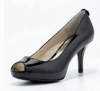
Peep toe
This shoe can be either a flat or a high heel.  It has a small opening at the front of the toe that allows a few toes to peep out.


T-Strap
This shoe has a strap on that comes up the top center of the foot and attaches to a strap that goes around the ankle.  It can be either a flat or a heel.


Sandal
This shoe can be either very high or low and features straps and does not cover the toes.


Strappy sandal
This sandal typically has a stiletto heel and has multiple straps that crisscross in various patterns across the toes and ankle.


Slides
Open toe shoe with a high or low heel.  This shoe is backless.  This is similar to the mule shoe but the mule has a closed toe.


Ankle boot
This boot has a low or high heel and they cut off just below, right at, or slightly above the top of the ankle bone.  They are great under pants or jeans.  I live in my ankle boots all winter when I wear pants.


Flat boot
This boot comes to the knee or mid calf and have an equestrian style or a motorcycle shape.  They have a flat heel or have a very low stacked heel.


Tall boot
A knee high (or taller) boot which every women needs a pair.  They can be very slim and sexy or chunky and edgy.  They fit everyone's personal style.  I love wearing mine with skirts all winter.  I own a black, grey, brown, and tan pair.  Love these!!!


Thong
This shoe is distinguished by a strap that runs up between the big and second toe.  A favorite to wear in the summer


Espadrilles
This shoe features a wedge heel made out of rope traditionally.  They are very comfortable and can be open or closed toe.


Gladiator
These flat sandals are inspired by the ones worn by the Roman fighters.  They have many straps across the ankle and across the foot.  They also are down as high heels or tall boots.


Be adventures with your shoes and try as many styles you can since it is an easy way to express yourself.

Monday, November 25, 2013

The essential wardrobe checklist

The Essential Wardrobe Checklist

One thing that really helped me create the closet that I currently have is understanding what are the essential items every woman needs in her closet.  These pieces are timeless, figure  flattering, and are modern classics.


Remember that when you are buying the essential items, they should cost a little more since you want them to last a long time.  I invest in my essential items and add in the trendy pieces that cost less to freshen up my closet year after year.

I have read lots of fashion books and watched way too much Tim Gunn Guide to Style, BBC America What not to wear and the TLC What not to wear shows which helped me create this essential wardrobe checklist.

TheDiva Essential Wardrobe Checklist:

Tops: 
  • Neutral cardigan
  • Crisp white collared shirt
  • Structured jacket
  • Dressy tank top
  • Dressy long sleeve top
  • Camisole
  • V- neck sweater (remember to try lots of necklines. cowl, square, crew, scoop etc.)
  • Simple cotton t-shirt
  • Zippered hoodie
Pants:
  • Black trouser
  • Dark wash jeans (pick the style that flatters you the most)
  • Medium wash jeans
  • Black leggings 
  • Capri pant
Skirts & Dresses:
  • Little black dress (LBB)
  • Day dress
  • Wrap dress (A girl's best friend!)
  • Pencil skirt
  • Maxi skirt
  • A-line skirt
Outerwear:
  • Denim jacket
  • Wool pea coat (try a long or short pea coat & try a fun color in winter!)
  • Trench coat
Footwear (this will be hard to narrow it down & play with color.  Make sure you have black, nude, brown and grey to start)
  • Ankle boot
  • Knee high boot
  • Pointed toe pump (It makes your legs look longer & they don't hurt!)
  • Ballet flat
  • Espadrilles
  • Sandals
  • Rain or snow boot
  • Sneaker
Undergarments:
  • A well fitted bra is one of the most important things you can wear (it keeps the girls up so you can see your waist line)
  • Thong or panties that don't give you lines
  • Tights in winter
Jewelry:
  • Pearl necklace & earrings
  • Cocktail ring 
  • Watch
  • Vintage piece with family history if possible
  • Statement necklace
  • Statement bracelet
  • Statement earrings
  • Diamond stud earrings (they don't have to be real)
Accessories:
  • Skinny belt
  • Wide belt
  • Simple day purse
  • Scarf
  • Evening clutch
  • Sunglasses
  • Umbrella

Building a closet of the essentials will take time but it is a great way to have the building block for looking great everyday and making it simple.

The most important thing is knowing who you are and your style!  Find what colors, patterns and styles of clothes you are drawn to take the time to understand your personal style.  Understand your body type and what cuts of clothing flatters your figure the best.

We are all different and we need to embrace what makes us all special!

Wednesday, October 16, 2013

Elements of Design - Time

Element of Design - Time
The final element of design which is not always thought about is time.  We tend to create space for the now and don't think about how the space will age and how time will influence the design.  Mother nature's forces have a way of affecting the way material look over time.

Colors fade, textures and forms will erode and shapes might even change so, designers need to think about this and design with the future in mind.

We also need to think about using sustainable materials in design so there is less impact on the earth.  Embrace older materials and mix with new to create a very unique design which will get better with age.

Designers also need to be aware of how people's impression and preferences may change with time.

The picture above shows how time has worn the brick down and allowed for grass to grow within it. This space has a great cozy feel with the weathered materials.  Also it shows a great way to use old materials in new spaces by the use of reclaimed barn wood as the house siding.

I also love using copper as an exterior material since it creates a great patina look with time as shown to the right.

It is important to embrace the element of time and create spaces that have a more timeless feel so they age well.

Below are a few of my tips I use while designing to create space that has a more timeless look:

  • Use natural colors for the more expense materials in your spaces. They shouldn't be too trendy.
  • Mix different natural materials in your design to create interest
  • Use color with paint and accessories since they are easy and cheaper to update when the color you used goes out of style.
  • Keep to simple designs that are not to trendy, clean and simple

I use these design tips for commercial and residential design and it has worked well the last 14 years.

Time is a very important element of design since we need to think about creating space that will last a while and improve with age.


References:
  1. Kilmer, Rosemary & Kilmer W. Otie (1992). Designing Interiors. Orlando, FL.  Harcourt Brace Jovanovich College Publishers. pp 97

Saturday, September 7, 2013

2013 Fall fashion color trends


2013 Fall color trends
It is the time of year when the days get shorter, a cold breeze is in the air and fall fashion trends emerge.  The Pantone 2013 fall color trends are a great tool to reference when you are wanting to add some fresh colors to your wardrobe.
  This fall the color trends are a mix of different emotions.  The deep colors that is typical of fall create a sophisticated feeling.  The bright pink, orange, and red create a very vivid and lively feeling.  Unique shades of green carry from the spring/summer but are less bright which is refreshing for the fall and creates variety.  The purple and orange deepen from spring and the neutrals this fall get deeper with a great balance of warm and cool with the use of grey and brown.

Below are the summaries for the Pantone Fall 2013 color trends and a link to the full article.


Fall Fashion Trends:
I truly love fall and enjoy reading my Vogue and InStyle September issues.  Below are some fall fashion trends I am seeing.

  • Menswear
    • Use of hounds tooth, plaid, herringbone, structured jackets and tailored pants. 
    • Men's style shoes 
  • Floral prints
  • Animal prints
  • Stripes
  • Houndstooth 
  • Graphic patterns
  • Leather jackets, skirts and pants
  • Simple elegant design with lots of structure and very little details
  • Plaid - Which is influenced by the 90's coming back in style
  • Deep wine pants, sweaters and accessories
  • Large statement necklaces with lots of sparkle and mixing of gold, silver and gunmetal
  • Larger sweaters with skinny jeans and pants
  • Fuller skirts
  • Lace
  • Bright winter coats
  • Cap-toe shoes
  • Strappy boots
  • Ankle strap shoes
  • Stacked heels
My favorite fall trend is the menswear trend and houndstooth.  I bought a houndstooth jacket and I can't wait to wear it with my wine colored skinny pants.

Have fun adding some new fall items into your wardrobe and most importantly, stay true to your own style.   Embrace the trends that are your, push yourself a little to try something new, and find clothes that flatters your figure.

What are your favorite fall color trend and fashion trends?

Monday, August 12, 2013

Principles of Design - Variety

Principles of Design - Variety

The last principle of design is variety.  Variety means "to change the character" of a design element to make it different.  Variety is the complement to the design principle unity and it is needed to create visual interest in a space.

Without unity, a space will feel chaotic and without variety the space will feel dull and uninteresting.  Good interior design is achieved through the balance of unity and variety (which is easier said than done).  The design elements need to be similar enough so we perceive them to belong together in the space and be different enough to be interesting.


The image above is a great example of variety.  The picture frames are all very different but have some similar colors and shapes used in the design.  Also they are all hung at in a uniformed line to create unity.

Variety can be created by the following elements:

  • Line (thickness, thinness, value, angle, length)
  • Shape ( size, color, orientation)
  • Color (hue, value, saturation)
  • Value (darkness, lightness, contrast)
  • Texture (rough, smooth)

An effective way to use unity and variety in a design is by creating variations on a theme/concept.  A designer can repeat an element throughout the design to create the balance of variety and unity.

I hope you enjoyed the blog posts about the principles of design.  I have one more element of design I will write about and then fall color trends.

Let me know if you have any topics you want to learn more about.


References:
  1. Kilmer, Rosemary & Kilmer W. Otie (1992). Designing Interiors. Orlando, FL.  Harcourt Brace Jovanovich College Publishers. pp 121

Saturday, July 6, 2013

Principle of Design - Harmony

Principle of Design - Harmony

One of the last design principles is Harmony.  It works very closely with unity.

Harmony is created when all of the elements in a space work together to create a unified design.  Harmony creates a sense of restfulness.  It can be be done by using one color, use of similar forms that might be different shape, size or texture.

In the picture above I have created harmony with the decoration on the wood floating shelves.  The objects are different shapes and sizes but they are the same color and laid out in a symmetrical way to create harmony.

Harmony is a the principle that brings things together and complements each other.
It can be achieved in many ways and another example is through repetition and rhythm.

Repetition reemphasizes visual items and connecting parts and creating an area of attention.

I have moved into my new house two months ago and have been using unity and harmony to finish the last interior design in my home.  It has been really fun seeing how things come together.

Let me know how you have used harmony in your designs.

References:

  1. Kilmer, Rosemary & Kilmer W. Otie (1992). Designing Interiors. Orlando, FL.  Harcourt Brace Jovanovich College Publishers. pp 121

Friday, June 21, 2013

So what design style are you? part 2

So what design style are you?  
Part 2

This post explores 3 more designs style to help you find what interior design style best represents you.  There are so many different styles it is important to understand the differences so you can find the style for you.

Houzz.com has a great series of design styles so here is part 2 of what design style are you.


So you style is French Country

French Country is a design style that is very feminine and is a great mix of old world and effortless sophistication.

If you like gently weathered furniture, using vintage decor that is passed down through your generations, use of fresh flowers and floral patterns, layers of fabric and warm whites this is your style.

It is very timeless and very goes out of style.


So your style is Eclectic

Eclectic design is the perfect mix and match of the styles that best represents you.  If you like a few different styles and want to combine them to make it your own then you love Eclectic design.

It is the balance of using unique decor methodical mismatching, layering textures and the use of the unexpected accent to make your home one of a kind.


So your style is Rustic

Rustic design is creating a more cabin charm with rough unpolished wood with a more masculine feel.

If you like to use organic forms, weathered materials, repurposed vintage objects in your home, and warm earth tones this is the style for you.

I have really enjoyed learning more about the many different design styles.  As I keep reading about the different styles, I see many of my friends style become defined for me.

Let me know what you think so far and what style are you?

Thursday, May 30, 2013

So what design style are you? -part 1

So what design style are you?
Have you ever wondered what interior design style best represents you?  There are so many different styles it is important to understand the differences so you can find the style for you.

There is no wrong answer so I recommend learning about the different styles to help you design your home so it is a reflection of your person style.  I love using houzz.com for this since they have so many great images and articles to help you understand what style you like.


I found some 14 great articles on this topic at houzz.com.  Below are some of the links to articles to help you find the right style for you.

So Your Style Is Midcentury Modern

Midcentury modern's emphasis on simple details, clean lines, natural materials and a seamless flow between indoors and out.  

If you like use of lots of natural materials in your home with simple details, lighting to be a statement piece, Iconic furniture, sleek kitchens, and neutral colors with a pop of a bright accent color you will like Midcentury modern design.

So Your Style Is Traditional

Traditional decorating has thrived for so long because of its promises warmth and welcome, and it delivers. Refined furnishings, symmetry  mannerly textiles, dignified colors and a sense of order make this beloved style easy to live with.  

If you like symmetry, soft curves, simple calm colors, rick wood, use of molding and detailed trim, exotic rugs, floral patterns, and love old furniture you will like traditional design.


So Your Style Is Transitional

Transitional style is a blend of the comfort and warmth of traditional design with the clean profiles and understated colors of the contemporary design.  It is  Gracious, streamlined spaces that radiate harmony. It's about meeting in the middle of the two other styles.  

If you like two toned color pallets, simple silhouettes, neutral flooring, spaces of calm, crisp lines, and minimum accents than you will like transitional design.


So Your Style Is Contemporary

Contemporary design is what is  here and now. 

Today's trend is to be styles as less is more: smooth profiles instead of ornamentation, solid or subtly patterned fabrics in lieu of colorful prints, minimal accessories rather than big collections. 

What is the difference with contemporary and modern design?  Below is another great houzz.com article noting the differences.

What is the difference between modern & contemporary design link

If you like open floor plans, shine, high impact furniture, and being very in the moment this might be the perfect style for you.

I will post more design styles in part 2 -4 where I will share more great articles on French Country, Rustic, Arts & Crafts and Eclectic styles.  

Sunday, May 12, 2013

Principles of Design - Scale

Principles of Design- Scale
One of the last principles of design to write about is scale.  Scale is closely related to proportion except that scale is primarily viewed as a relative standard or measure outside of an object related to some constant unit.

In interior design, scale is sued as a way to compare the size of an object or an interior.  The photo is a great example of of how the little girl shows you how large the door really is.  If she was not there you might not be able to tell how large of a door that really is.

I just finished building my house and I noticed while in 2D the kitchen and family rooms felt good sized but I was concerned they would be too small.

Until the house was complete and we moved physical items into the house to give the rooms scale, it allowed me to see that the rooms were large enough and maybe could have been designed a little smaller.

Scale is a balancing act and hard to grasp it until the space is in 3D.

Scale can refer to small or diminutive as well as to large /grand size.  Models of interiors are made smaller to help designers get a better idea of how the space will look in three dimension before it is built.  We use computer modeling tools today which are all drawn is a scale (typically 1/8") to help with the design process.

References:

  1. Kilmer, Rosemary & Kilmer W. Otie (1992). Designing Interiors. Orlando, FL.  Harcourt Brace Jovanovich College Publishers. pp 120

Sunday, April 14, 2013

Principles of Design - Proportion

Principle of Design - Proportion
 The next principle of design to write about is proportion.  This principle is closely associated with scale because they both express concepts of relative size and magnitude.

Proportion is defined as the relationship of the parts to one another or to the whole.  Scale refers to the size of a item in relation or comparison to another item.  Proportion is thought of as the relationship of parts contained  within an object.

Proportion can be expressed as matters of width in relation to length with which designers seek to balance the parts to one another to create an aesthetic composition.

The Greeks create the basic principle of proportion when they developed the ""golden rectangle" which is a ration of two parts to three.  The golden rectangle represents the division of a form or line in which the side of the smaller portion in relation to the larger is identical, as the side of the larger part is to the whole object.  This idea is that the division of a line between one third and one half of its length which produces a pleasing proportion to the eye.

The photo above of Frank Gehry's AGO shows the curved wood divided in 3 thirds to create a very proportionate design as the wood bends up the side of the building.


The image to the right shows how the stairs have a yellow paint line on the top third of the step.  It creates a pleasing proposition of the steps and a beautiful pattern as you look up the stairs.


References:

  1. Kilmer, Rosemary & Kilmer W. Otie (1992). Designing Interiors. Orlando, FL.  Harcourt Brace Jovanovich College Publishers. pp 119-120


Sunday, March 24, 2013

2013 Spring color trends

2013 Spring color trends:
Spring is in the air and time to talk about the Pantone spring color trends for 2013.
This spring the color trends are all about balancing the brights and pastel soft colors of spring.

This spring using 3 shades of green to really bring life into the season.  Green is a great color and I love the 3 different shades of green in the color trends since this is a green for everyone.

Below is a link to the entire Pantone 2013 color trend report.

Pantone 2013 fashion color report spring 2013 link


Thought on the color trends for spring:

 I love the use of soft pastel colors this spring mixed with the bright colors.  My favorite color in the spring color trends is Linen.  I it s lovely simple neutral that works with any other color to soften up your spring look.  It is a fresh new color for spring and I just love it!

Inspiration:
This spring I am building a home I designed and most of the colors I am using in my house are in the Spring 2013 color trends.  Most of the house is a warm grey with white and espresso brown wood.   The accent colors in the house are Poppy Red, Vibrant Orange, Emerald and Tender shoots.

Prominent Colors:
This spring in my fashion I have been really drawn to Emerald.  I love green and it balances my red hair, pale skin and green eyes.  It is a fun fresh color that can put anyone in a good mode.  We have had a long winter so I think that is also why I have been drawn toward green.   


Signature color:
My signature color is orange!  This spring I am love mixing Nectarine with Linen. They complement each other nicely.  I love a pop of orange and I love the men's color vibrant orange this spring as well.

Must have item:
My spring must have is a fun floral skirt and peplum top.  I love the way a peplum top creates amazing curves on every body type.  It is a must have this spring.

Below are the Spring 2013 color trends for men. They changed the orange to be a little brighter which I really like, changed the yellow to a more gold shade and added 2 grey naturals into the pallet.  It is a very fresh and strong look for spring.  


I really am enjoying the current fashion trends this spring.  There is something for everyone.
Spring fashion trends are:

  • Floral prints
  • Black & white geometric prints
  • Cut outs
  • Bright colors color blocked with the lighter pastel shade
  • Bond stripes
  • Leather
  • Embellishments with beads
  • Sporty
  • Flat or low heels


Let me know what your favorite color and fashion trend is for Spring 2013.

Most importantly is to have fun with fashion and try something new this spring!