Friday, December 21, 2012

Principles of Design - Balance

 Principles of Design - Balance
One of my favorite design principles is balance.

Balance in design is best described as a visual balance that relates to the apparent perceived weight of an objects within a space.

There are three basic types of balance  symmetrical, asymmetrical and radial.


Symmetrical Balance:
Symmetrical balance refers to the arrangement of objects within a space that appear to have a a central axis and equal on both sides. 

The picture above shows a very symmetrical interior design.  The glass is mirrored from a central wall with a light fixture as it's focal point and the furniture is mirrored on both sides of the center wall.

Symmetrical design is used in a lot of traditional design.   It feels more formal to the eye.  It creates a sense of belonging for the objects in the room which is calming to some people.  This type of symmetry is reflected in the human body which some think that is the reason people feel comfortable in a balanced space.

I do like symmetrical design.  I like order so I am calm and happy in a very balanced space.

Asymmetrical balance:
Asymmetrical balance is used in contemporary and modern design.  Balance is achieved with some dissimilar object that have equal visual weight.  Asymmetrical balance is more casual and less rigid but more difficult to achieve.  Asymmetry suggests movement within an interior space.

The picture below shows asymmetrical balance with the similar look of the red womb chair on the left side of the space and the Eames chair on and couch on the right side of the room.  They visual balance the room but the space is not a mirror image.

I do like asymmetrical balance and it does take a good eye to pull it off well.  It also creates a unique design.


Radial symmetry:
Radial symmetry is very similar to symmetrical balance but the design arrays around a center point.  

In the picture below shows a great example of radial balance with the tulip table and chairs, the light fixture and even the daisy flowers on the table.   They also also have a hint of red on them which also creates unity in the space as well.


I am building a new house and I have used both symmetrical and asymmetrical balance in the design.  I will share photos of the new house this spring after it is done and after I share the remaining design principles.

Thanks again for enjoying my blog this year.  I can't believe how many people have read my blog and enjoyed reading about what shoes go with what pants.  I will be writing another post in the near future about shoes 101.  It will describe the different styles of shoes since I am such a HUGE fan of shoes.

Happy Holidays and thanks for following in 2012!  See you in 2013.

References:
  1. Kilmer, Rosemary & Kilmer W.Otie (1992). Designing Interios. Orlando, FL. Harcourt Brace Jovanovich College Publishers. pp. 114-116


Sunday, November 25, 2012

Principles of Design - Unity

Principles of Design - Unity
I thought it was time to finish the blog posts about the elements and principles of design.

Principles of design are applied to design elements to bring them together into one complete design.  The way the principles of design are applied determines how successful a design of a space can be.

Unity means keeping your design in a sort of harmony in which all sections of the pattern make other sections feel complete.  Unit helps the design to be seen as one design instead of randomness.

To achieve visual unity all elements are in agreement.  No individual part is viewed as more important than the whole design.  A good balance between unity and variety must be established to avoid a chaotic or lifeless design.

When I am designing space it is hard to explain when something is not unified so I tend to go with my gut and feel when the interiors is unified.  There is a sense of coming together and when you have success  it is when the space feel complete.  Before that point it was missing something or something was just not right.

There are a few methods used to create unity:
  • Proximity
    • How items are placed within a space is key.  As you see in the picture above, the Eames side chairs are located within the room.  They bring together the white wall and the white sofa along the windows.  They also fill the space since they are located in the middle of the space.
  • Similarity
    • You can see how using similar finishes create unity in the photo above.  The same color of wood in the trim, ceiling, floor and Eames chairs bring the space together.  The other finishes in the room are white or in a neutral tone so one one piece stands out it all works together.
  • Rhythm 
    • Rhythm is illustrated above with the light grey wood wall in the photo above.  The strong horizontal lines of the wood wall create a flow which adds depth to the space and complements the strong lines in the wood ceiling and floor.   The key reason this works in this space is that the lines of the wood don't fight with each other, they create the unity in the space.
References:
  1. White, Alex (2011). The Elements of Graphic Design. New York, NY: Allworth Press. pp. 81-105. 

Monday, October 29, 2012

Fall shoe trends

2012 Fall shoe trends
I love fall and I really love shoes so I had to write about some of the new fall shoe trends I have been reading about and seeing.

There are so many shoe trends this fall so there is one for everyone!  I do have my favorites....

We need to start off talk about boots!


Knee-High boots:
This style is back and looks even sleeker this fall.  I recommend having at least one black and brown pair of knee high boots for fall/winter.  I also have a blond pair which I love and I am looking for a grey pair.  If you want to elongate your legs find a boot with a pointed toe.  It makes you legs look so long and amazing!

Flat Knee-High boots:
Another great boot style for a more casual look and great for weekends!  A flat boot is comfortable and look great with jeans, dresses and skirts.  Find a pair with some fun details on them to really show your personal style.

High-Heeled lace up boot:
A new boot trend this fall.  The lace up boot is very edgy and the high heel adds a level of sexiness.  They are a fun way to add a fun shoe if you have the a standard knee high boot.

Low-Heeled ankle boot:
These are always in style (thank God!) but this fall you are seeing more fun leather colors, animal prints and a more causal boot.  The style has a more rounded toe.  I am a huge fan of pointed toe shoe so I tend not to wear my grey rounded toe ankle boots.  I think this fall I need to pull them out of my closet.

Now let us shift gears to the menswear trend this fall in shoes.

Cap-Toe Oxfords:
The shoe is very comfortable and the cap-toe adds a pop to sharpen up any outfit.
They look great with jeans or if you want a men's wear twist to an outfit.  I don't own a pair but I might need to try these for a fun casual shoe.

High-Heeled Loafers:
The 90's loafer has had a face lift and looks sophisticated and sexy.  The high heeled loafer has a slimmer profile and added the high heel really makes a statement.  It is a great shoe to wear with a more traditional outfit to add a twist of freshness.  I am looking for a pair of these but not super high.  I need my heels 3" or lower.

Finally we shift to the 3 trends for the heel for this fall.

Evening T-Straps:
This retro style heel has reached new heights and are perfect for a night out!  Have fun with crystals, details, metallic colors, and shine.  This is the way to show your personality in your shoes.  They are very sexy and make a statement.

Ankle-Strap Pumps:
The little strap across the ankle is very flattering.  Find a pair in a fun color, material or animal print to make a simple outfit pop.  I have a few pairs of ankle strap pumps that I wear to work and they also are great with jean or going out.


High-Heeled Mary Janes:
I do love the simple school girl Mary Janes and this fall they are making them sexier.  The profile is slimmer and I also have seen some Mary Janes with a pointed toe instead of the standard rounded toe.  I would love a pair of these in my closet. I think the desire happened when I watched Sex and The City and Carrie found the black patent leather  Manolo Blahnik Mary Janes in Vogue.  I love that show and I think there is a little bit of Carrie in me.


Shoe love affair

Many of you how do know me knows I love shoes and I express myself and my mood through my shoes and fashion.  I also have been very inspired by Sex and the City so I wanted to share my shoe closet with you all.

I will never count how many pairs I own but I love my shoe collection and ladies, you just need to have fun with shoes since they can make any simple outfit make a statement.

Enjoy the fall shoe trends and I am looking for my high heeled Mary Janes!


Wednesday, October 3, 2012

Houzz.com - Home design ideas and more!

Houzz.com- Ideas for modern design

A few weeks ago I found a wonderful website that has images, ideas and great articles for home design for any style.  It is called Houzz.com  I LOVE it!  


I am building a house and it has really helped me get inspired for my residential project since I am a commercial interior designer and things are different.

I highly recommend everyone to check it out.  They have great articles about all types of styles, rooms and more.  


Modern Kitchen design by New York Architect Chelsea Atelier Architect, PC

Below is a link to a few articles I found that I really enjoy.  They are are about modern design, modern kitchen design and the use of a fun accent color as a front door (orange).


I am planning on using the midcentury design style in my new house and having an orange front door too.  It is my signature color and it would be fun and unexpected.

I hope you find Houzz.com as interesting as I have.  Feel free to follow me at houzz.com,  My profile name is thediva.

Enjoy!!!


Monday, September 10, 2012

Fall 2012 Pantone Fashion Colors

Fall 2012 Pantone Fashion Color Tends
It is my favorite time of the year, FALL!  I love everything about fall and most of all the new fall fashion and color trends.  Below is a quick summary of the Pantone Fashion color report fall 2012.  

I love the 2012 fall color trends this year.  They are very rich and bright this year with a hint of rose and lavender.  The bright colors from summer do continue a bit but some are toned down for fall.  

The ankle colored pant is still very hot and I have found it in stores in most of the colors above!
I will write more about fall fashion trends in my next post.  

Design Inspirations
The Pantone report shares some top designs inspirations and other thoughts around the fall color trends so I wrote up my thoughts on the fall colors;

Inspirations:  I look toward fashion and fabrics for my color inspiration when designing interiors and my jewelry.  I love the use of bright rich colors with texture, and rich neutrals   The current project I am working on uses the rich french roast browns, light titanium grey colors, and white as the foundation to the design with pops of red, orange, gold, blue, teal and bright chartreuse.

Prominent colors:  I love the rich grey Titanium color with golds but I have falling in love with the Ultramarine green fall this fall.  It is so rich and makes a statement when used with neutrals.  

Signature color:  Bright orange!  It is bright, fun and unexpected

Must-have item: Menswear tweed pencil skirts.  I love the classic sexy line of a pencil skirt and the rich texture of tweed in fall will never go out of style.

Cosmetic accents: I love wearing a red lip with a very neutral eye.  It is a fun way to add a hint of color.


Below is the men's fashion color trends.  I really like the rhubarb color and will be using that in my own fall fashion and interior design.  


Here is a link to the full report if you are interested.

http://www.pantone.com

Happy fall shopping and try a new color this fall!  I tried purple this year and I love it!

Friday, August 17, 2012

Elements of Design - Form

Elements of Design - Form
The final element of design is form.


Form is any 3D object.  Each form has depth, height and width.  Forms also are defined by light and dark


 Types of Form:
There are two types of form;
  • Geometric or man made forms
    • Squares, circles, etc..
  • Natural or organic forms 
    • leaves, snowflakes, etc..


Forms may be created by the combining of two or more shapes.  They can also be enhanced by tone, texture and color.

Form follows function
A principle associated with modern architecture / design in the 20th century that the shape of a building or object should be the primary based upon its intended function or purpose.  

The American architect Louis Sullivan lead the form follows function concept.  Below is his full quote:

    "It is the pervading law of all things organic and inorganic, or all things physical and metaphysical, of all things human and all things super-human, of all true manifestations of the head, of the heart, of the soul, That the life is recognizable in its expression, that form ever follows function.  That is the law."

I love modern design and the simple concept of form follows function.  The image above some one of my favorite classic furniture, the Knoll tulip table and chair.  They form of the chair follows the line of the back to make a comfortable sit.

Using the correct forms can make or break good design.  They are very powerful elements in design.

References:
  1. Saw, James. "Design notes". Palomar College.
  2. "The Tall Office Building Artistically Considered," published Lippincott's Magazine (March 1896).

What is next?
I have finished writing about the elements of design and I am going to start writing about my favorite time of year, fall!  
It is that time and I am going to shift to fall color and fashion treads before writing about the design principles.

I hope the blog series of design elements have been helpful understand the core of design.

Friday, July 27, 2012

Elements of Design - Space

Elements of Design - Space    
Space is concerned with the area the design will take place on.  


Categories of Space: 
There are four types of space:
  • Positive space - It is similar to positive shape that it is the figure or foreground space and the focus of the design.
  • Negative space - It is similar to negative shape that it is the empty space that is the background or what surrounds the subject matter.
  • Shading - Shading adds gradation marks to make an object in 2 dimensional surface seem it is 3 dimensional.  Below are the 5 kinds of shading light which used together create 3 dimensional look. 
    • Highlights, Transitional Light, Core of the Shadow, Reflected Light, Cast Shadow
  • Perceptive - It is the graphic arts that is an approximate representation of and image that is perceived by the eye on a flat surface.
    • Non Linear Perspective - Is the method of showing depth that incorporates the following techniques:
      • Position - The placement of an object higher on the page which makes it appear farther back than the other objects place on the lower part of the page.
      • Overlapping - When an object overlaps another object it appears closer and the object behind the object appears farther away.
      • Size variation - Smaller objects look farther away in the distance and larger objects look closer.
      • Color - Bright colors look like they are closer to you and neutral colors look like they are farther away.
      • Value - Lighter values look like they are farther back and darker value looks like they they are closer.
    • Linear Perspective - Is the method of using lines to show the illusion of depth in a picture.
      • One point perspective - When lines are created by the side of objects and they all meet at one point on the horizon.
      • Two point perspective - When two lines look as they are meeting at two points on the horizon line.

References:

  1. Saw, James. "Design Notes". Palomar College.


Saturday, July 7, 2012

Elements of Design - Texture

 Elements of Design - Texture
The next design element and one of my favorites besides color is texture.

Texture is the way a surface feels or is perceived to feel.  Texture can be added to attract or repel interest to an element depending on the pleasantness of the texture.

Types of Texture:
There are two main types of texture.

  • Tactile Texture is the actual three dimensional surface that you can feel.  The photo above is one of the design projects I worked on that used a lot of types of texture.  The wall is a drywall tile that creates a three dimensional texture to a wall which created the look of frosting in this space.
  • Visual Texture is the illusion that a surface has peaks and valleys.  Lots if images of nature and art appear they have a texture but it is smooth to the touch.  
Most textures have a natural feel but still have a repeat in some way.  The regularly repeating of a motif will result in a texture that appears as a pattern.


 The images in the blog post are from a project I worked on which used lots of different textures to create the sophisticated look and feel of the space.

The feature wall is a drywall tile that when installed creates a tactile texture of waves on the wall.  I also found a light fixture used at the bar that has the same waving tactile texture as the wall to tie the space together.

The kitchen wood is very smooth maple with a tight grain which is a contrast to the wavy texture of wall.  The final texture used in the kitchen is a small 1"x1" mosaic tile which adds texture and a hint of sparkle.

  The rest of the space is in a deep red and brown paint color with a hint of greenish tan.  The meeting space across from the kitchen has a large dining table which are two large pieces of rustic walnut which created the top which adds visual texture into the space. It is smooth so people can use it to eat on or meet at with their laptops but you can see the very textured wood grain in the table top.

The sofas are a nubby brown fabric to create a cozy feel.  The space is defined by a large semi-shear drapery that create a visual texture and creates privacy since the meeting space is next to a main traffic path.


The use of many types of texture together can really create a nice cozy and sophisticated feel.  This applies to interior design and fashion.

In fashion, mix a smooth pant with a more textured top and top it off with a necklace with depth and sparkle to take it up a notch. 

I do use my design elements and principles in my fashion choices and how I design my work projects, home and garden.  The are key things to learn when creating any type of design.

References:
  1. Saw, James. "Design Notes" Palomar College.


Monday, June 25, 2012

Elements of Design - Shape

 Elements of Design - Shape
The next design element to discuss is Shape.

A shape is a defined as an area that stands out from the space next to it or around it due to a defined or implied boundary or because of differences of value, color or texture.  All objects are composed of shapes and all other elements of design are shapes in some way.

Categories of Shape
There are 6 categories of shape.

  • Geometric Shapes: These are the shapes that can be drawn using a ruler or compass.  Mechanical or geometric shapes produce a feeling of control or order no matter how simple or complex they are. 
  • Organic Shapes: These shapes are drawn freehand and are more complex and are normally found in nature.  They are free flowing, informal and irregular.  Organic shapes produce a natural feeling.
  • Positive Shapes:  These shapes are the solid forms with in the space.  The wood beams in the photo below create the positive shapes.
  • Negative Shapes:  These shapes are the space around the positive shape or the empty space.  The circles shown in the picture above are negative shapes.
  • Static Shape:  These shapes have the appearance of being stable and at rest.
  • Dynamic Shapes:  These shapes have the appearance of being active and moving.


I feel calm when my life has order so it does not surprise me I feel my commercial and residential design with geometric shapes.  I also love the Mid Century Modern style that uses lots of squares, circles and rectangles along with with simple clean lines.

Shape is a powerful element.  It can be used to create a feeling of control, bring in a natural feeling, calm or motion.


References:

  1. Saw, James. "Design Notes" Palomar College. 
  2. Cindy Kovalik, Ph. D and Peggy M.Ed. "Visual Literacy".

Sunday, June 3, 2012

Elements of Design - Color

Elements of Design - Color
 The next and one of my favorite elements of design is color.  Color is the hue, shade or tone of an object.


Categories of Color
There are 3 basic categories of color.


  • Primary Color - They are red, blue, and yellow.  
    • These colors are equal distant on the color wheel and are used to make up other colors.  
    • Most large companies use primary colors since people think of them as safe are people relate to the colors ( Walmart, Target, McDonalds etc..)
    • I have found these 3 colors are very safe colors to use at work and home design and people do except them easily.
  • Secondary Colors - They are orange, violet and green.  
    • These colors are created by mixing of two primary colors.  
    • Secondary colors are used to be more vibrant than the primary colors and more unique.  
    • Companies that use secondary colors are trying to stand out and are sometimes are more sophisticated than the standard Primary colors (Starbucks, and Home Depot) 
    • I have found that people have strong positive and/or negative reactions to Secondary colors at work and in home design.  Some people love or hate orange, purple and with green, it all depends on the shade of green you pick.
  • Tertiary Colors - They are Red-Orange, Yellow-Green, and Blue-Violet.
    • These colors are formed by mixing of a primary and secondary color.
    • Tertiary colors also are not as accepting as primary colors for people.
    • They do ad a layer of richness to a color palate and makes it feel less childlike and more sophisticated.


Below is the color wheel to show you the 3 different types of color.


Color is categorized by how the colors are used together.
  • Analogous colors:
    • The analog color are those colors that lie on either side of it in the color wheel.
      • For an example, Red, red-orange and orange.
  • Complementary colors:
    • These colors are opposite of the color wheel and when placed next to each other they look bright.
    • When they are mixed together they neutralize each other.
      • For an example, blue & orange or red & green, or violet & yellow
Perceptual attributes of color
There are tree attributes of color which creates the millions of different colors used in our world.
  • Hue - It is the redness, blueness or yellowness in each color
  • Value - It is the lightness of color.  Tints and shades of color that are created by adding black to a color for a shade and adding white for a tint.  Creating a tint or shade of a color reduces the saturation.
  • Saturation - This is the color's brightness or dullness

Grouping of colors
There are also three grouping of colors that have similar characteristics.
  • Monochromatic is the where one color is used but in a different value or intensity.
    • For an example, using a dark brown, brown and light brown colors together
  • Warm colors are the colors on one side of the color wheel that give the felling of warmth.
    • For an example, red, orange and yellow
  • Cool colors are the colors on the opposite side of the color wheel as the warm colors and they give a feeling of coolness.
    • For an example, blue, violet and green


Ways I use color in design
I love using color in my interior design and fashion. 

 I like to start with a neutral background and add layers of color into the design.  I like to use color as accents and end the use of color at an inside corner.  I use color to create/accent an architectural element in the design.  

Like the picture shows the use of red near the TV adds in a layer and a pop of color which a white background.  I also like to add pops of color with accent pieces.  (I tend to use color the same with interior design as I do fashion which is really fun).  


I also use color in my Corporate projects to organize the space.  I am using warm colors on the east side and cool colors on the west side of my Canada project to create order and way finding.  So if you are standing in a green space you know you are on the west side of the floor.

The use of color in ways that is can be changed out as color trends change.  I use it in less expensive materials (fabric, paint & accessories) and use neutral colors for the more expensive things (wood cabinets, carpet, furniture).  This allows the space to easily be updated with low cost as trends change.

Never be afraid of color.  It is a simple way to energize a space or outfit!

References:

  1. White Alex, (2011). The Elements of Graphic Design, New York, NY Allworth Press pp 81-105.


Monday, May 21, 2012

Elements of Design - Line

Elements of Design - Line
One of the key things I learned in college while studying Interior Design were the Design elements and principles.
 Elements of design are the fundamental building blocks to art or design.  Design principles describe how the design elements come together to create design.

I use the 6  elements of design and 9 principles of design everyday at work and at home.  I wanted to write about each design element and principle to explain how to use them together to create visually pleasing design.  Learn, do, teach

LINE
Line is an element of design that is used define shape, contours and outlines.  It is as simple as two connecting point form a line and each line has length, width and direction.

Lines are used in the following ways in design:

  • Contour lines - They describe the shape of an object and defines or bounds an edge,.  
  • Divide space: - A line that defines the edge of space and can also create a gap of negative space.  They create outlines of shapes.
  • Expressive line - Line that are energetic and catches the movement & gestures of an active thing.
  • Implied line - Lines that are not actually drawn but created by a group of object seen from a distance.


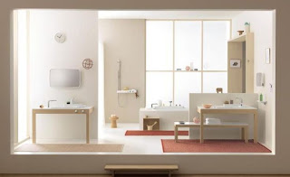
I love mid century design which uses crisp clean lines.  The image of the bathroom above shows a wonderful use of straight lines to create order, unity and defines the space.

I will write more often now as I touch on these fun key design elements and principles.  It is fun to share ideas and I hope you can learn to look and understand design better after I write about the elements and principles.

References:

  1.  Saw, James. "Design Notes" Palomar College.
  2. Lovett, John. "Design and Color"
  3. Bartel, Marvin. "Composition and Design".


Friday, April 27, 2012

Inspired by InStyle

Inspired by InStyle Magazine
I am inspired by lots of things for my fashion and interior design projects.  One other passion I have is making jewelry.  I started back in 2000 when I was planning my wedding and I have been doing it ever since.

I find lots of my inspiration for color pallets for my jewelry, fashion and design comes from magazines.

My most current inspiration has been the monthly InStyle color crash course section in the magazine.

Here is the January 2012 color crash course inspiration for a necklace using Seafoam, Mint, Ocean blue, sand and coral crystals.        

Here is my my necklace using those colors.  Since I am so inspired by InStyle I decided to write in and share my note to the "Inspired by InStyle" section in the magazine.


 I am in the May 2012 addition in the Inspired by InStyle section.  It was great to see my short note in the magazine.


Peacock Blue inspiration
Here is the December 2011 InStyle color crash course.  

Peacock blue is a great color and they recommend pairing it with Charcoal, silver, eggplant and Cinnabar for fun.

Here is the necklace I created with the Peacock colors.


Grape Inspiration
In February 2012 InStyle Grape was the new color that inspired me.

They recommend pairing the following colors with grape:
  • Coral red
  • Teal
  • Ivory
  • Yellow for fun


Here is the necklace I created with the grape colors from InStyle.

Peach Inspiration
In April 2012 InStyle magazine the color of the month was Peach.

They recommend paring it up with the following colors:

  • Coral
  • Silver
  • Champagne
  • Lavender for fun


Here is my necklace using the Peach inspired colors from InStyle.


I will be adding all of these to my etsy.com site snap*string if anyone wants to purchase them.

http://www.etsy.com/shop/snapstring


You never know where your next inspiration will come from and I love using magazines for that.  You can use the tips for fashion, home design and so much more.

The May InStyle color this month is Lemon so that will be fun to create a great bright spring necklace.

What inspires your design and fashion?  I would love to hear your ideas and thoughts.

Saturday, April 7, 2012

Neutrals with spring colors

 Neutrals with spring colors
This spring there are so many colors to choice from and if you are afraid of trying color blocking (I am at times) here are some ideas of what colors to pair with our favorite and some new neutrals.

I found these wonderful tips in the March issue of InStyle magazine which I recommend picking up.

Ivory
Instead of the crisp white this year try a creamy ivory.  It brings a vintage feel to your outfit.  Ivory works great with pastel colors and also with bright bold colors.  InStyle recommends you coordinated it with a crisp color otherwise it will look murky.

Try the following colors with Ivory this spring:
Forest, cornflower, candy apple, or buttercream

I love pairing this neutral with a metallic shoe or a coordinating color so I am not matchy matchy.


 Gray
I love gray.  It can be a dark or light gray color but it is one of the most popular neutrals now.

You can coordinate pale colors or take a fun approach and use a bold primary color.

Try the following colors with Gray this spring:
Cobalt, seafoam, lavender, or lemon

I love pairing this neutral with a black heel or a coordinating color heel to mix things up.
Khaki
You can't go wrong with Khaki.  It works well with fall shades of color (which I love) and you can also have fun with bright green.

Try the following colors with Khaki this spring:
Pumpkin, violet,mustard, or lime.

I love pairing cream, brown heel with this neutral or a coordinating color like red with the orange and yellow or a different shade of green when wearing lime.  It is all about playing with combinations.
 Navy
I struggle with adding navy into my current wardrobe.  I was in high school in the early 90's when all you wore was navy, hunter green and burgundy so I had an overdose of it.

It is a great traditional preppy classic color.  You can freshen it up with new vibrant colors.

Try the following colors with Navy this spring:
Orange, bubblegum, turquoise, or Kelly green.

I would pair a fun colored shoe with this neutral or a cream/khaki heel.  Don't try to wear a navy colored shoe with navy pants/shirt. The colors will never match and it will look off.
Olive
I love this newer neutral.  It is more unexpected and military inspired.  Create a more feminine look with very light ladylike colors or take it up a notch and add a pop of red or bright yellow.

Try the following color with Olive this spring:
Cantaloupe, petal pink, scarlet, or celery.

I would pair this neutral with a cream or metallic heel.


This blog post is dedicated to my good friend Sandy who is so sweet and asks me questions all of the time about what goes with what.  I hope this helps you Sandy as you add to your wardrobe.

Sunday, March 25, 2012

Color Trends over 3 Centuries

Color trends over 3 Centuries
One of my favorite things to read about are color trends.  It is amazing to watch how colors change from decade to decade and you remember each decade from the colors in style in those decades.  Color trends change due to world events, technology advancements, fashion and design.


I just finished an article by Benjamin Moore explaining the color trends over three centuries.  Here is my summary of the article.

1880's
This was the time of High Victorian era.  The changes in the world that decade were the Second Industrial Revolution, The Brooklyn Bridge opens and the Eiffel Tower is opened at the 1889 Paris Exposition.  The use of ships and trains made travel more easy and trade between countries around the world.  People were moving to America and brought an eclectic mix of style and home interiors.

The colors were lighter as you see above the soft pinks and purples.

1890's
The events that era was the 1893 Chicago World Fair, the new patented on the incandescent light bulb and the emerging social classes.  The Victorian tastes/styles were getting rejected and the new trends were to functional space.

The colors were richer and more organic.  Art Nouveau style influenced the colors of the decade.  Use of gold, orange, brown, blue, olive green and poppy reds.


1900's
A new century which brought lots of new innovation into the world.  It was a era of luxury living for the wealthy.  The Cubist art movement started and influences the decade.  WW1 began and a new desire for women's rights began.  Clothing became more utilitarian.  The Bauhaus school started which stressed the design concepts of straight edges, absence of ornamentation and function.  The Arts and Crafts style started this decade as well.

The colors were still organic.  Yellows, teal/green, and orange were popular.


1910's
The colors of this decade is influenced by society shifting to a very practical mindset.  The Arts and Craft style still influenced design and the US was starting to be seen as an industrial power.

Colors shifted more deep and rich.  Ochre, olive greens, browns, red and a little blue.

1920's
Radio networks start and there is a large influence on new technology and materials.

The colors are cooler, hazy and more grayed.  Pastels and neutral colors become popular.

1930's
The great depression affects this decade and becoming thrift is the way of life.

The colors become organic again since the culture is shifting to back to the basics.  Use of muted tones of beige, brown, and rusts are used.


1940's
WW11 is in full force and the women move into the workforce.  the ideas of "Waste not Want Not" and "Make Do and Mend" are the way people live.  After the war ends the baby boom begins at the end of the era.

Color options are limited due to the war.  They are influenced by the war and are brown based.  Use of khaki, green, tan and hits of red & navy blue appear.

1950's
The US is in the glory of WW11.  The Civil Rights movements begins and the baby boom continues.  Television becomes the new medium for entertainment and changes the design of the family room.

The colors in this decade are more sky blue, baby pink and are a little more upbeat.


1960's
Kennedy is president and pushes the ideas of prosperity and innovation.  Baby boomers are teens and the space age begins.

Colors are more futuristic and playful.  you see copper, brighter psychedelic colors


1970's
Civil rights, space exploration and women's rights advance and a new concern for the environment affects the US.  Disco dominates the music as well as a punk and funk movement.

The colors of the decade are unforgettable.  The use of earth tones, browns, gold orange and avocado.  Oak is the wood of the era.


1980's
It as know as the decade of excess "more is more".  The economic boom triggered the use of pastel and white in design and fashion.

The colors in that decade were cooler and more gray.  Mauve, dusty blue, mint green and black and white granite.

1990's
It was the electronic age and the introductions of the web, email and texting.  There was also a green movement as the concern for global warming began.

The colors shifted more organic.  The use of jewel tones like burgundy, jade green, navy blue and golds.


2000's
A new century begins and 911 changes everything.  The economy shifts and the housing market drops and the US moves into a recession.  The decade also sees a movement of mass customization and an Individualism.  The computer influences and dives a very fast pass lifestyle with a balance of environmental dearness.

The colors used in this decade are silvers, orange white, red, and lots of shades of greens ranging from acid to grayed.


I do love following color trends and I will write soon about the interior color trends of 2012.  There is a shift to more grays and not as much brown and lots of blues, yellow and greens.

Monday, March 12, 2012

Tips on organizing your closet

Tips on organizing your closet.
Spring is here and it is the perfect time to change out the heavy winter clothes, bring in the fun colorful spring clothes and organize your closet.  

I LOVE changing out my seasonal clothes because it gives me time to bring back pieces I loved and purge items that are not worn as much or are looking tired.

Below are 5 simple tips on organizing your closeting and keeping it fun!


Tip 1- Keep the space fun like a boutique!
You want to enjoy your closet so make the space fun to be in and organize your closet so you can see it all.
        • Add a fun right accent paint color in your closet to keep it fun and fresh.
        • Add in fun art.  I have pictures of shoes in my closet
        • Change your light fixture to a fun fixture like you see in stores.
        • Use old furniture to store your clothes.  Like a bookcase or hang wall shelves and place your sweaters, bags or shoes on them.
        • Go to your favorite store write down what displays you really love and figure out how to create that at home.  I bet you can make it work!
        • Organize your accessories so you can see them all.
          • I hang all of my belts and scarves on an IKEA towel holder.  I love it since I can see them all and it adds a fun pop of color.

Tip 2 - Color code your clothes
    • Organize your clothes by type (tops and bottom) and then color code them.
    • As you can see, I have all of my tops color coded on the top of my closet.  
Color coding your clothes allows you to see where your holes are.  For an example, I tend to have a lot of orange tops right now and by doing this I can see I have a few but my blue section is small.  

I also pick clothes by color so it makes decisions faster.

Color code your pants and skirts too.  It really helps you know what you need and spend your money wiser.  

I also organize my shoes by color but I will not show you all a picture since I have lots of shoes!


Tip 3 - Always refresh/organize your closet every Spring and Fall
  •  When you are moving the other season clothes out, make a note if you wore it a lot or not.  If not Toss it!
  • Don't keep things in your closet if you have not worn them in over a year.  They are holding up space for something else you might love.


Tip 4- Have a place to play our your weekly outfits
I love to sleep so every Sunday I plan my outfits for the week.  This allows me to sleep in a little, rotate my clothes and make sure I am wearing variety every day.

  • Add in wall hooks or something you can hang out the week's outfits in advance so you can be better prepared each week.
  • Have a full length mirror in the space so you can see what the outfits look like before heading out the door.

Tip 5 - Invest in quality not quantity
In my 20's I would buy lots of clothes that was cheaper and did not last me awhile and were very trendy.  Now I am in my 30's I am working on buying quality pieces that will last me years and not go out of style.

I will post in the future about some of my stable items in my closet.


I sure hope you all have fun the next few week making your closets a fun place to be in, organized, fresh and current.

Don't forget to post questions or comments on what you like or don't like on the blog.

Thanks,
TheDiva

Monday, February 27, 2012

Favorite modern design websites to shop

My favorite modern design websites to shop
As you know, I love modern design and I wanted to share with you all some of my favorite places to shop online for modern design items for my home, cards and even dog accessories.  

Modern design can get confused with Contemporary design but they are different. 

Modern Design using very clean simple lines, geometric patterns, using the idea of less is more, and use of nature materials like teak and leather. It was created in the 1950's in German when the Bauhaus school of design started.  (I will post more about design style history in the future).  Modern design spaces are typically neutral with splashes of color.  It has more of a retro look and feel to it.

Contemporary design using lots of curves, it is very playful using lots of reflective materials, unusual colors, and asymmetrical patterns.  It was created in the 1960's & 70's as part of the post modernism movement and it strong today.

Modern design websites to shop
Below are a few of my favorite site I shop on line when looking for great modern design for my home.

http://www.crateandbarrel.com/

How can you not love Crate and Barrel.  I have loved them for years.  Their sell updated version of modern European design.  I did not notice this until I was in Finland last year and saw how European looking the products Crate and Barrel sells.  I love them!

http://www.cb2.com/
cb2 is a more playful version of Crate and Barrel.  I love their products and they have great prices on accessories and other furniture.  CB2 is a little bit more contemporary but still has a modern feel to it.

http://www.westelm.com/
Oh how I love west elm.  They have GREAT prices and wonderful modern design pieces for your home.  I owe lots of their shelves, end tables and accessories.  I also love the partnership they have created with Benjamin Moore on selling their paints and noting in their magazine what BM paint they used.  All of their products are designed to work with their paints.  They make it so easy!!!  If you have not checked them out it is a must!
(This photo shows west elm shelve and accessories)


http://www.ikea.com/us
The wonderful blue and yellow box in the sky!  I love IKEA and have been shopping their for over 12 years.  They have crazy good prices and the Swedish sure are amazing designers.  They now sell many different styles of design for great prices around the world.  I thought I would grow out of IKEA but that will never be the case. (this photo shows IKEA lights, shelves, metal wall shelves with west elm & Crate & barrel accessories)

http://www.rockscissorpaper.com/
Rock Scissor Paper is a wonderful card site owned by 2 sisters in San Francisco.  I love their moderns cards and paper products.  They have classic modern designs and new fun playful ones.


http://www.trendypet.com/index.php
Trendy Pet is a site that sells wonderful modern dog bowls.  I am VERY particular on what I put in my house and I wanted a nice simple modern raised dog bowl for my whippets.  I found this great site and own 3 of these bowls.  My pups love them & so do I.


http://www.lolldesigns.com
Loll designs makes outdoor furniture made out of recycled materials.  I want a few chairs some day in my back yard.  You can order different styles of furniture in many different colors and it good for the environment. (their products are pictured at the top of the post).

http://www.2modern.com/
2 Modern is a nice site that sells classic modern furniture and other accessories.  It is not cheap but they have great stuff and so many options to pick from.  My of my favorite chairs is on sale here and I told my husband he never needs to by me diamonds for my anniversary, just classic chairs.

https://www.onekingslane.com/
One Kings Lane is a new site I found that has lots of interesting accessories in many different styles.  The prices range but if you are looking for some special no one else has, this is the place for you.


I hope you enjoy shopping these sites for your home.  I love checking back at these sites often to see what is new and what is on sale!  Enjoy